Sustainable Package Design
CLIENT
M&M Food Market
[School Project]
SKILLS
Print Production
Package Design
(Bilingual) Layout Design
Brand Consistency
Sustainability
Visual Strategy
Custom Mockup
SOFTWARE
Illustrator
Photoshop
DIMENSIONS
[insert]
DATE
February 2025
PROJECT OVERVIEW
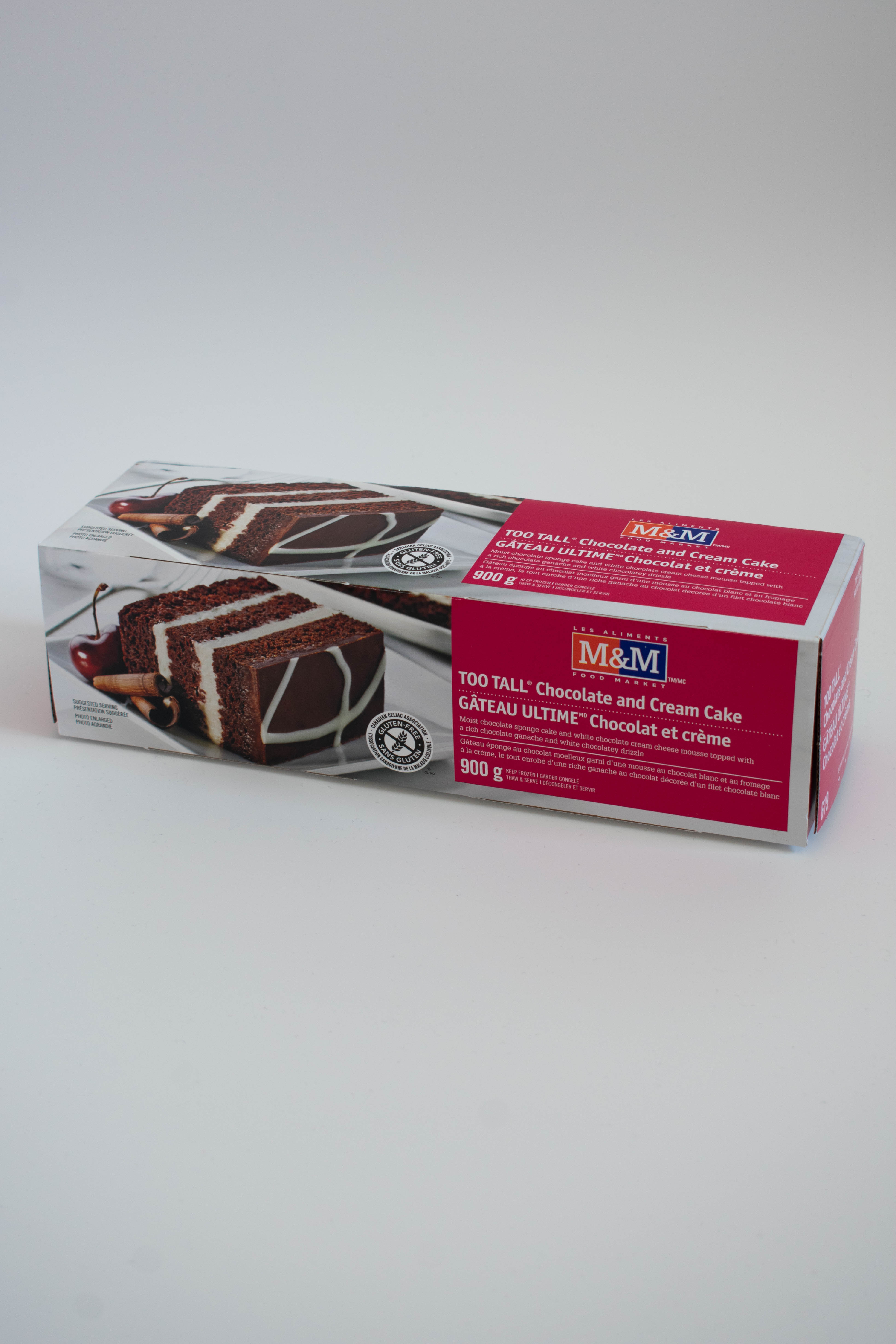
For this project, the goal was to take a harmfully packaged product and transform it into an environmentally friendly redesign. Since the original packaging for this cake was already entirely cardboard, I had to do my research and determine what makes this package design bad for the environment.
SKETCHES
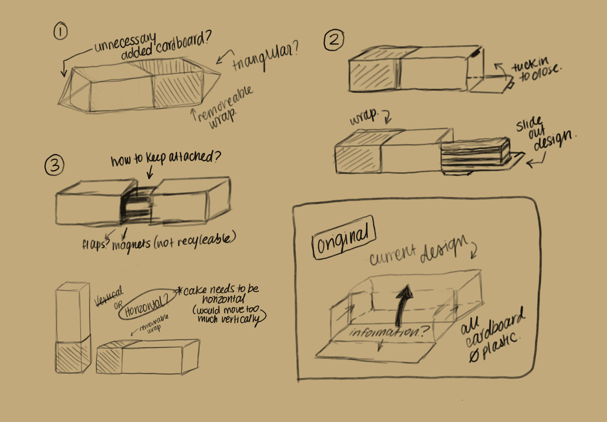
To begin the process, I started sketching out how I could change the box structurally, if I even could. Ultimately, I came to the decision to stick with the current packaging box since it best suited the transportation and protection of the product.
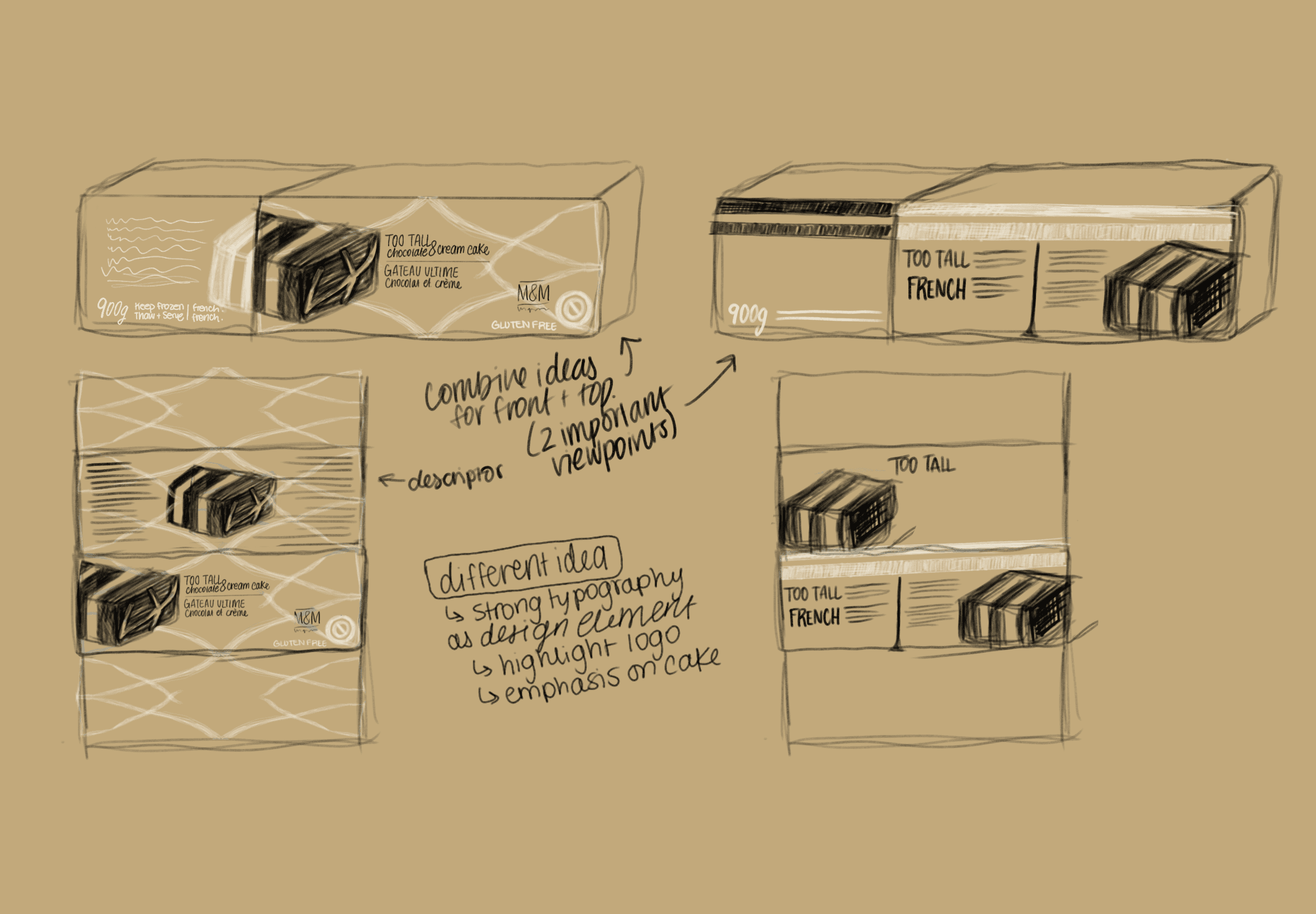
After my research into sustainable practices in package design, I began sketching out some options for the design itself, including having a cardboard sleeve that would cover half the box. I was also trying to decide whether to stick with the same design on the front and top of the box - something you'll see I explore in my 3 design concepts.
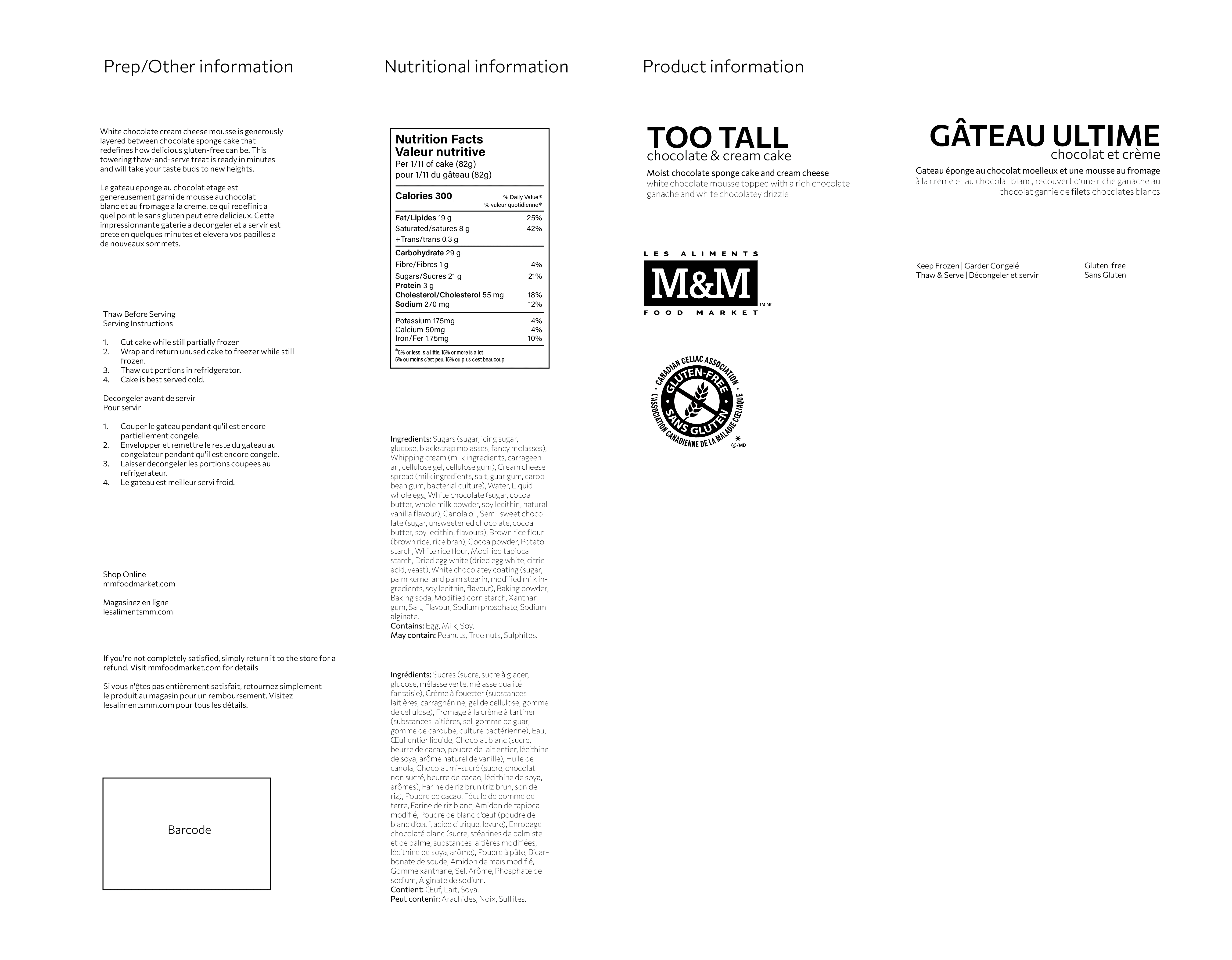
To complete this project, it was absolutely NECESSARY to buy the product itself, so I could then take the cardboard box, flatten it and measure everything so I'd have an accurate dieline to work from. It was also important to be able to record all the copy on the box, so I could incorporate it into my own design.
THE MAIN PROCESS
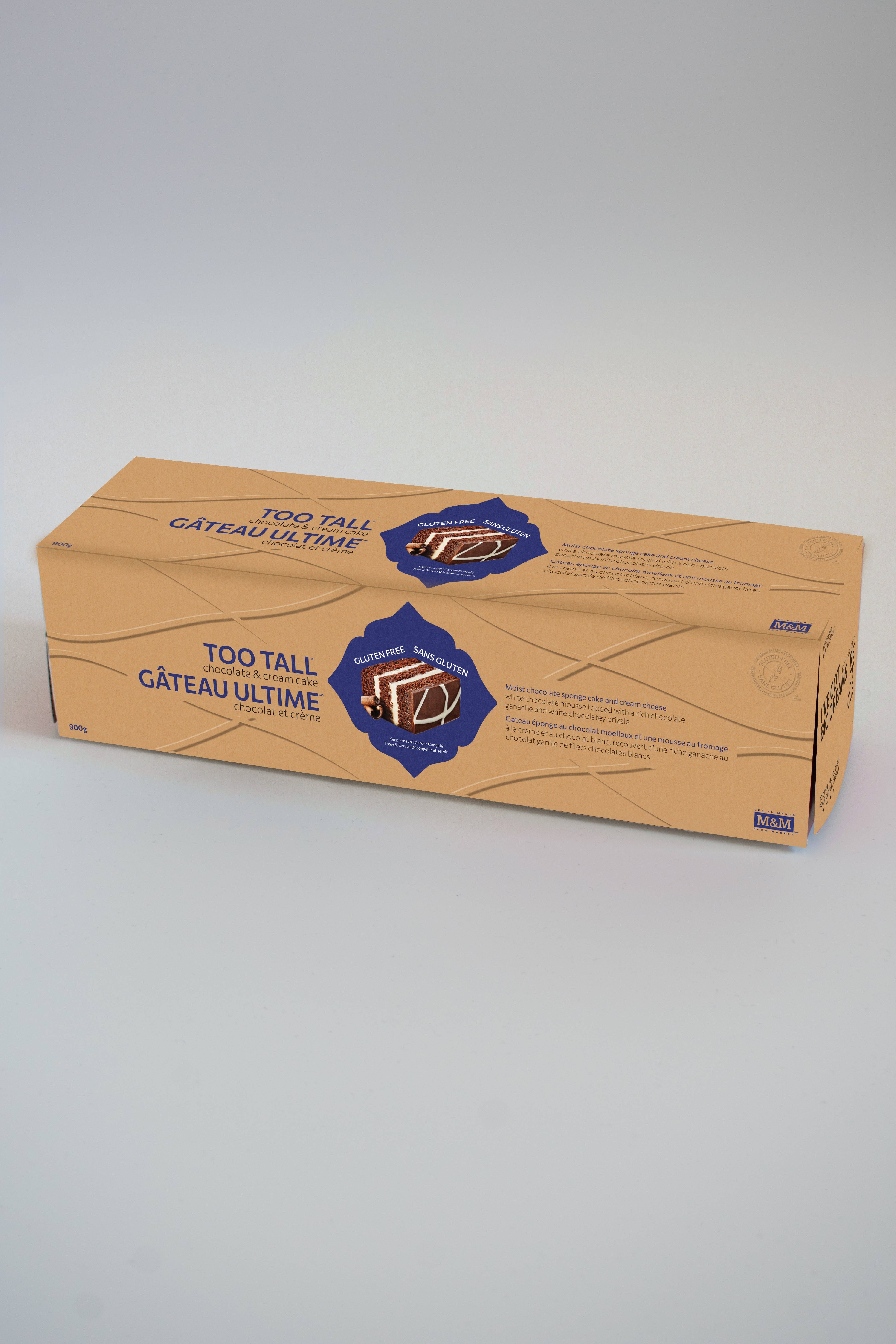
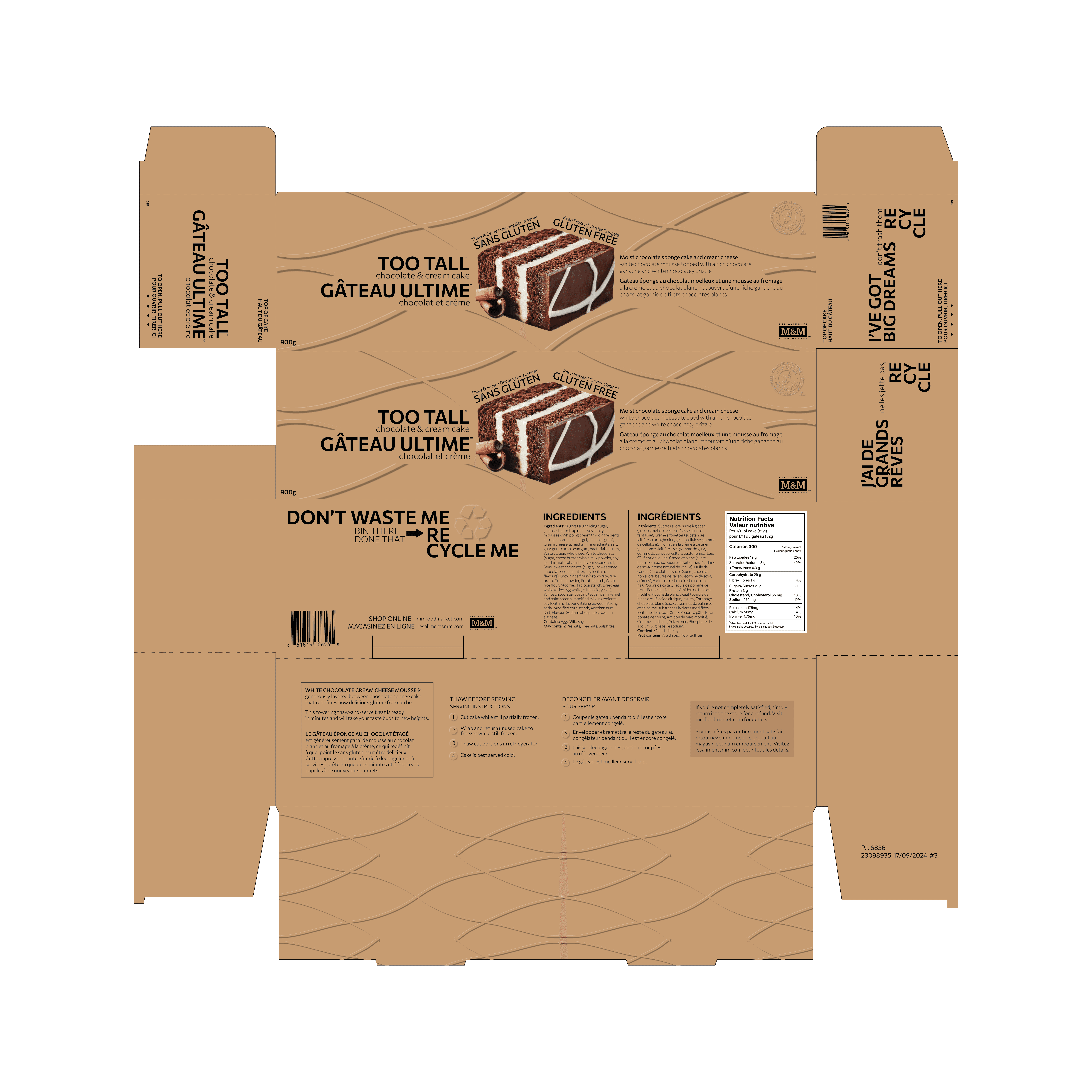
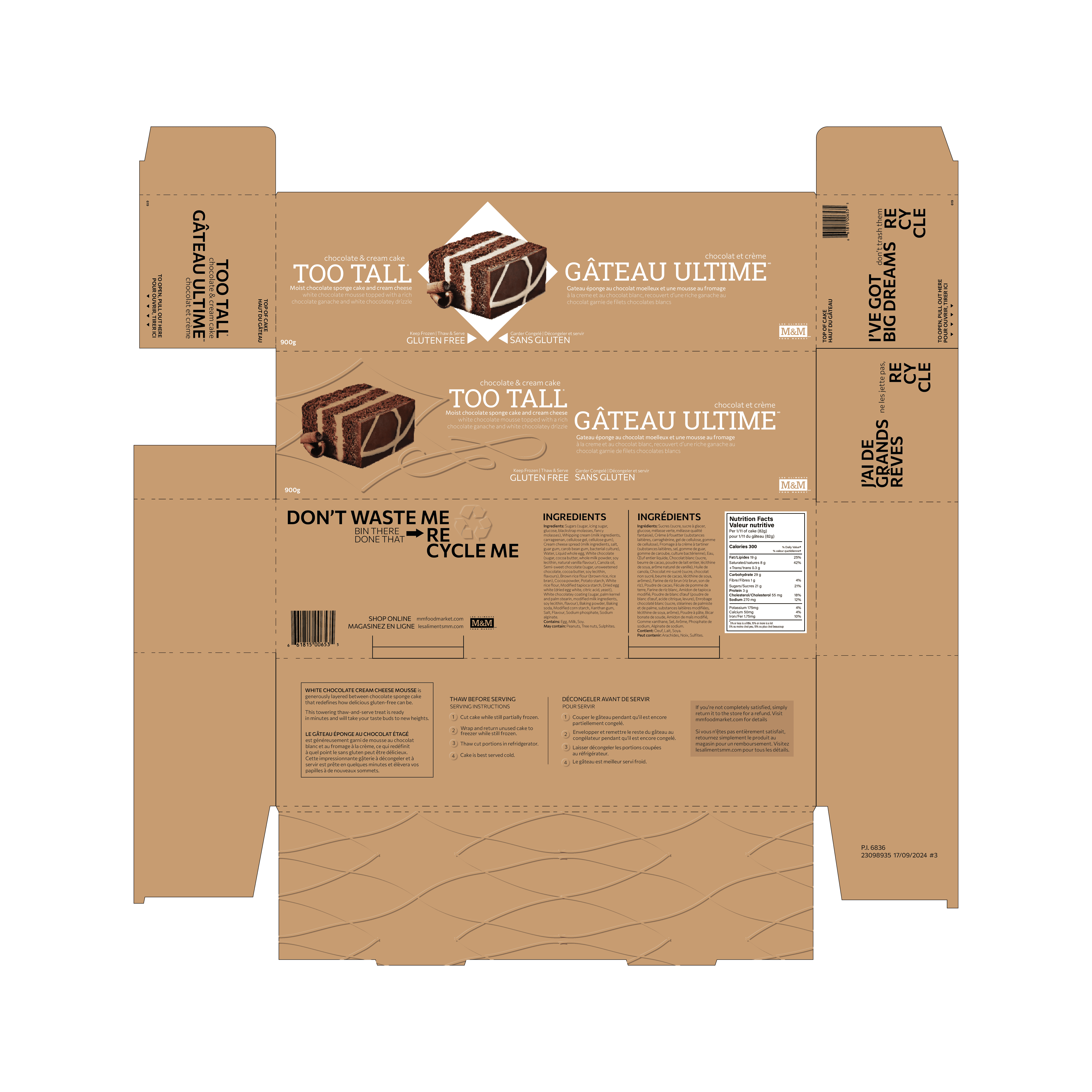
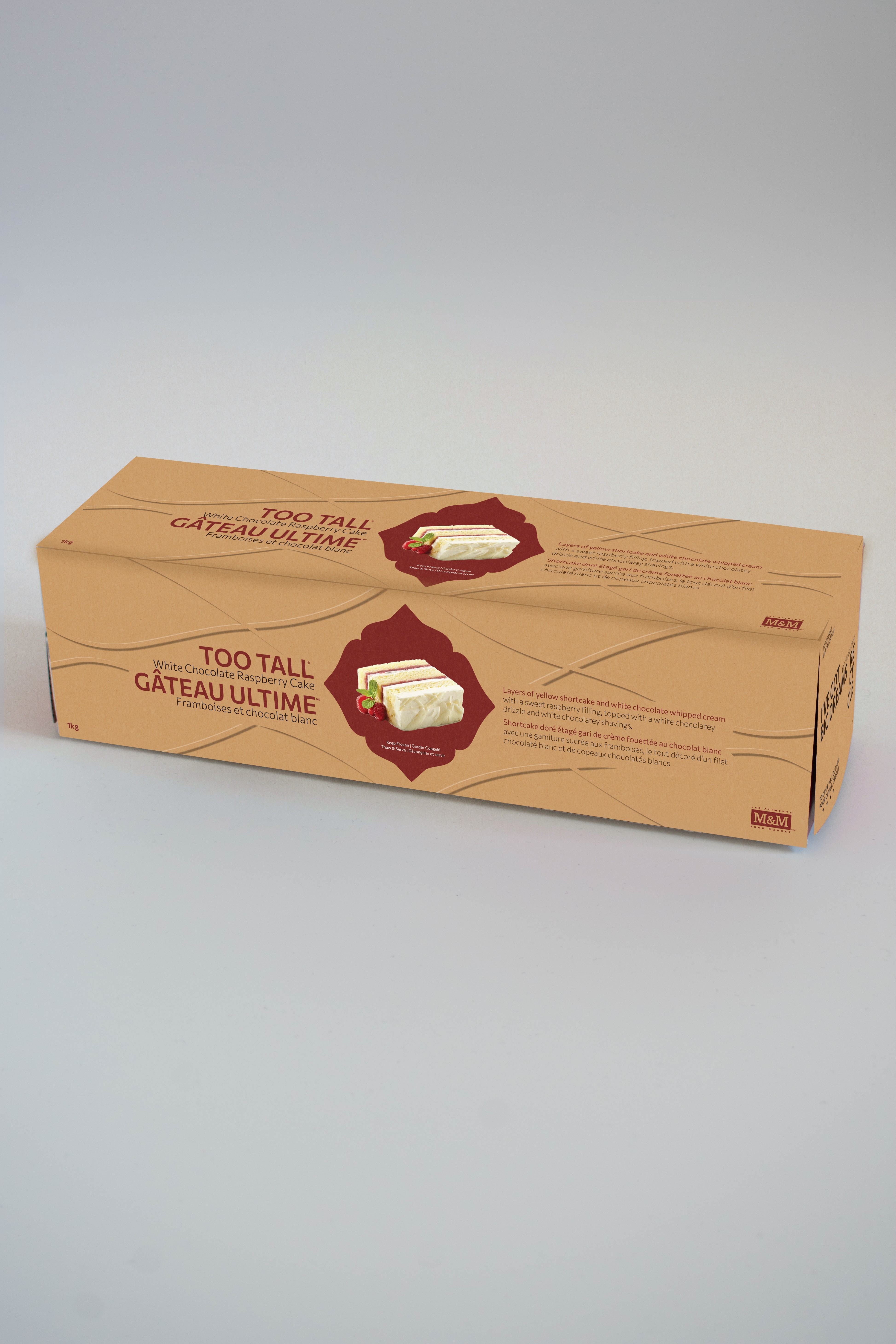
Using Adobe Illustrator, I started by challenging myself to design three different package design variations, using the same layout. I focused on changing aspects like colour, layout, typography, and supporting graphic elements to create variety. After developing three design variations, I combined the strongest elements to create the final direction and then applied the system to another product in the line. The final design uses sustainable techniques such as embossing, retaining the natural cardboard colour, limiting ink colours and coverage, and reducing photographic elements.
3 DESIGN CONCEPTS

CHALLENGES
The main design challenge was figuring out how to create hierarchy and distinction between textual information when removing full ink coverage and photography elements from the original packaging layout. It becomes a lot harder to section information and keep it visually interesting against the natural cardboard colour. Along with that, I also had to consider how to balance the English and French copy equally within the layout.
FINAL DESIGNS
When I first started this project, I struggled to see behind the non-plastic packaging and wasn’t sure what I could improve in terms of sustainability. But I honestly enjoyed this project because it helped refine my ability to research, taught me about sustainability when it comes to packaging and product design, determine how to use design principles to balance languages and consider inclusivity and package design appeal, all while keeping it environmentally friendly.
The final part of this project was applying the package design to another product in the line. After finalizing everything in Illustrator, I needed to make my own mockup, since this box design is very unique and there's no way I would be able to find what I needed online. I took some photos of the original box, and then used Adobe Photoshop to make my own mockups - something I hadn't done before this project.

Final Package Mockups


Final Flatlay Designs
Before & After Comparison