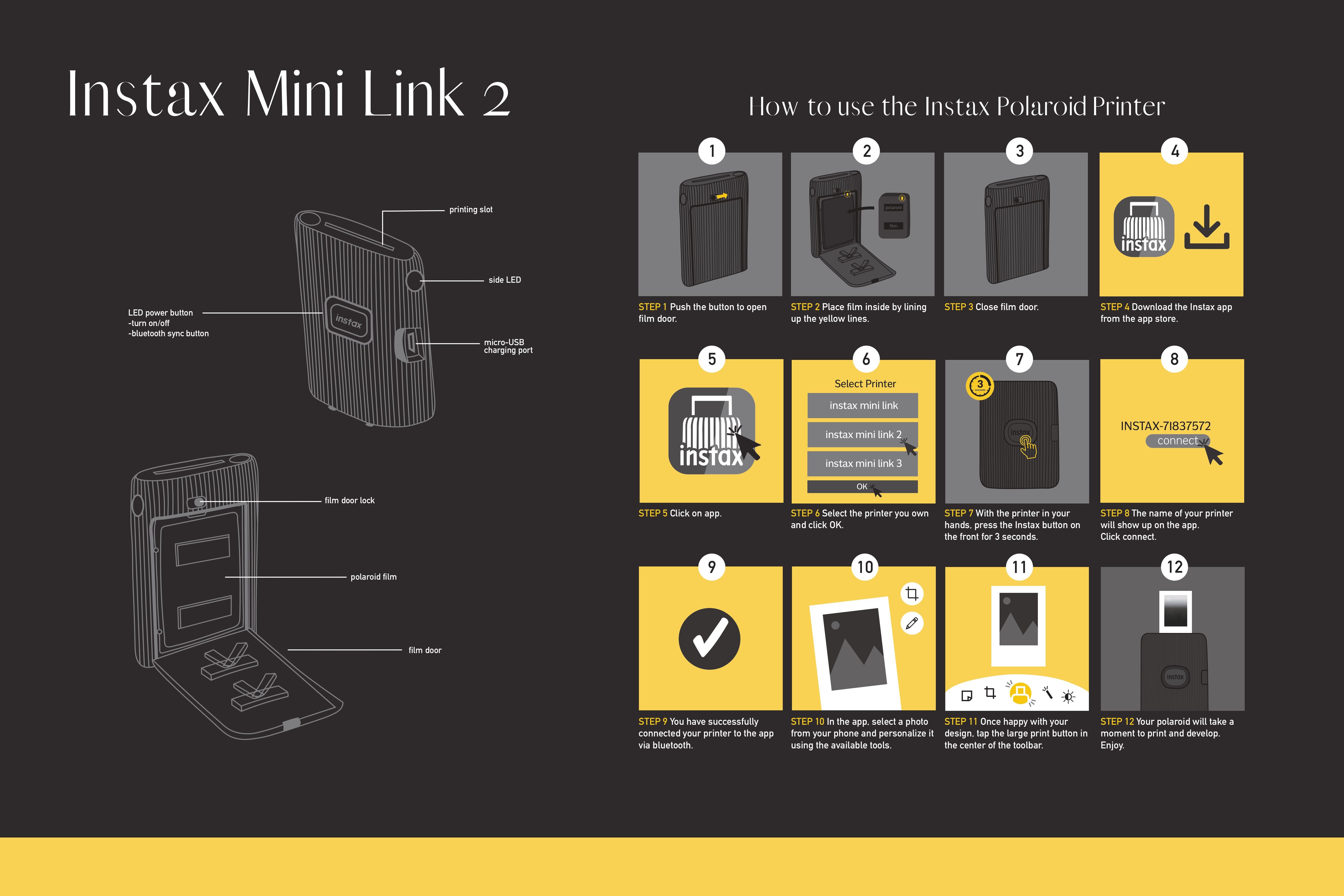
Instax Informational Poster
CLIENT
Instax
[School Project]
SKILLS
Layout Design
Illustration
Technical Drawing
Step-by-step Instructions
SOFTWARE
Illustrator
DIMENSIONS
11x17" Poster
DATE
October 2024
PROJECT OVERVIEW
The priority for this instructional poster project was to demonstrate my ability to illustrate technical drawings and break down complex information into clear, step‑by‑step instructions. This poster would be perfect for anyone that is interested in perhaps buying the Instax Mini Link 2 and is wondering how it works and how easy it is to work with. This would also help people who already own it understand how to use it. This would also help new Instax users since it’s a similar process across their Bluetooth and film products.
SKETCHES
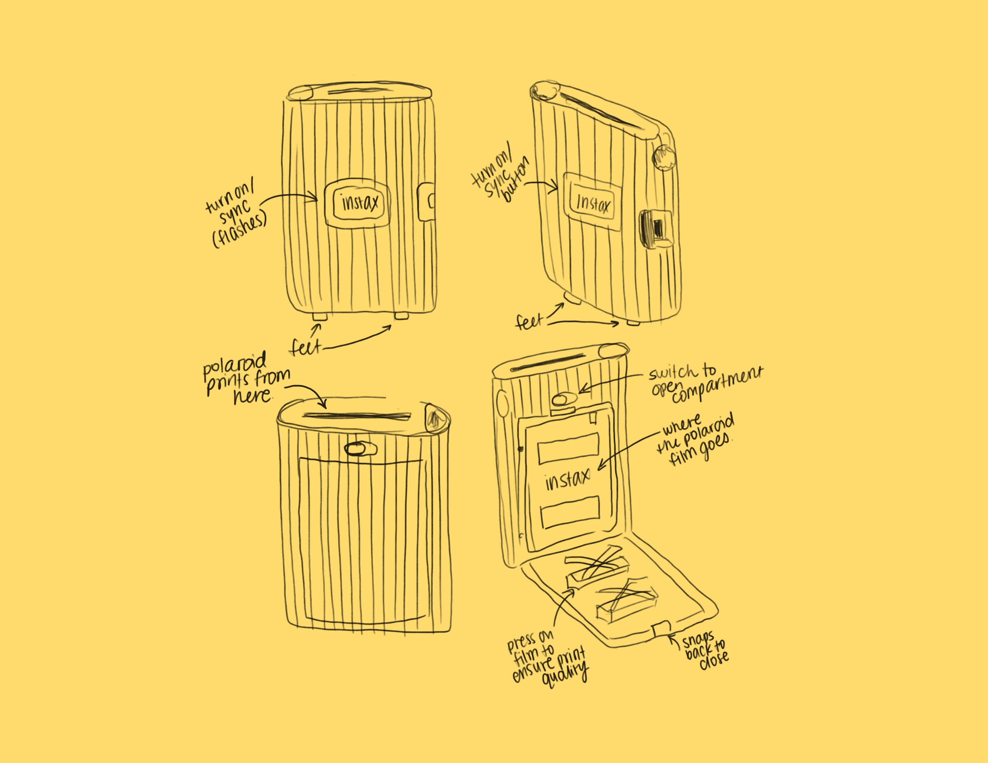
I started by listing out all the actions a user takes when using the Instax Mini Link 2, keeping in mind that the goal was to create a simple user‑map rather than document every possible feature. From there, I sketched out the different product perspectives I’d need to illustrate the process. Combining the steps and the visuals gave me a solid foundation for the poster.
THE MAIN PROCESS
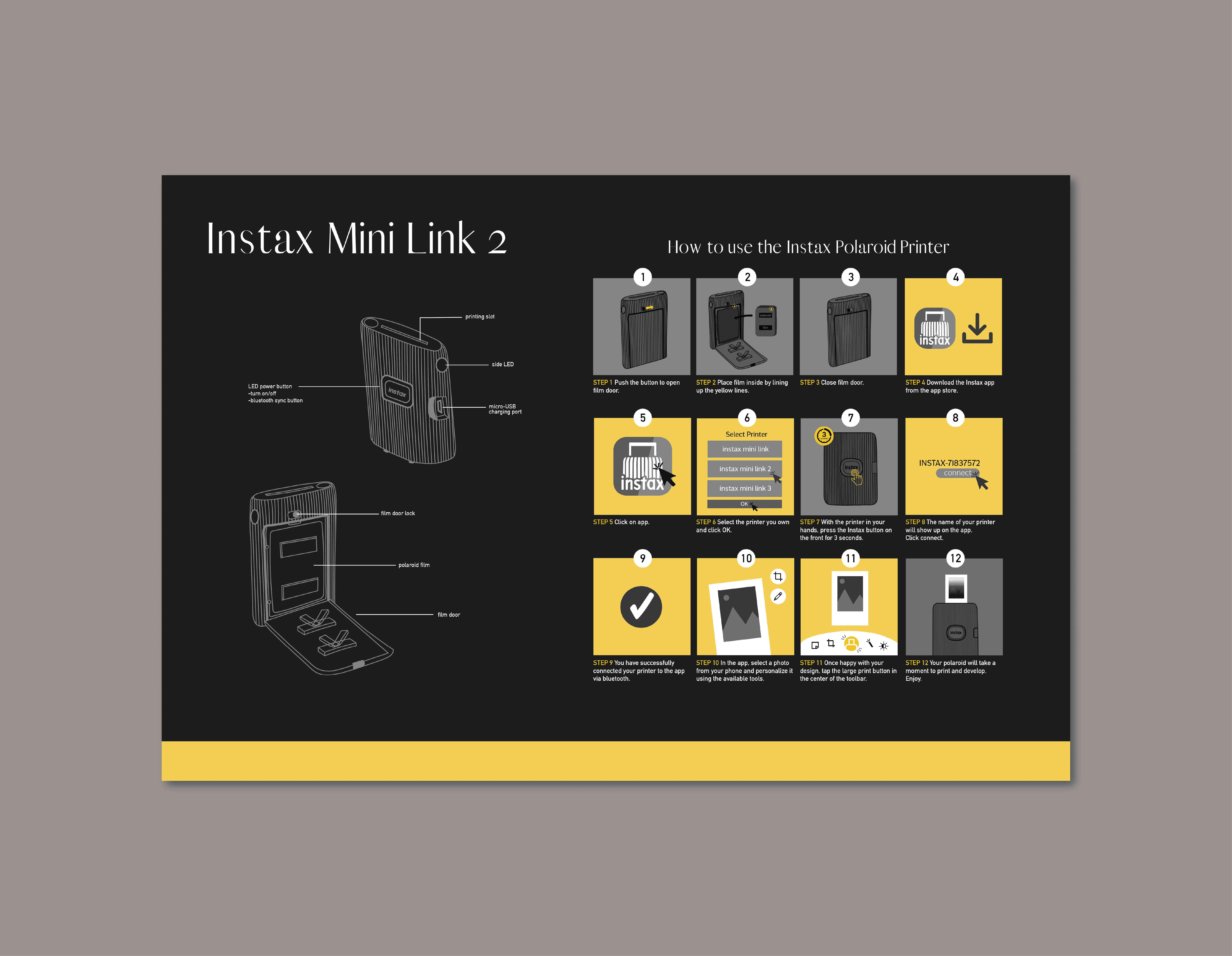
I refined the number of steps, removing anything unnecessary, and built a grid to organize the sequence clearly. Partway through, I realized I needed to separate the in‑app steps from the physical, real‑world actions, so I introduced a small colour distinction — grey for physical steps and yellow for in‑app interactions. It’s subtle, but it helps clarify where each action takes place. Alongside the short written instructions, each illustrated step also includes visual cues, making the information easy to skim without having to read every word.
LAYOUT & COLOURS
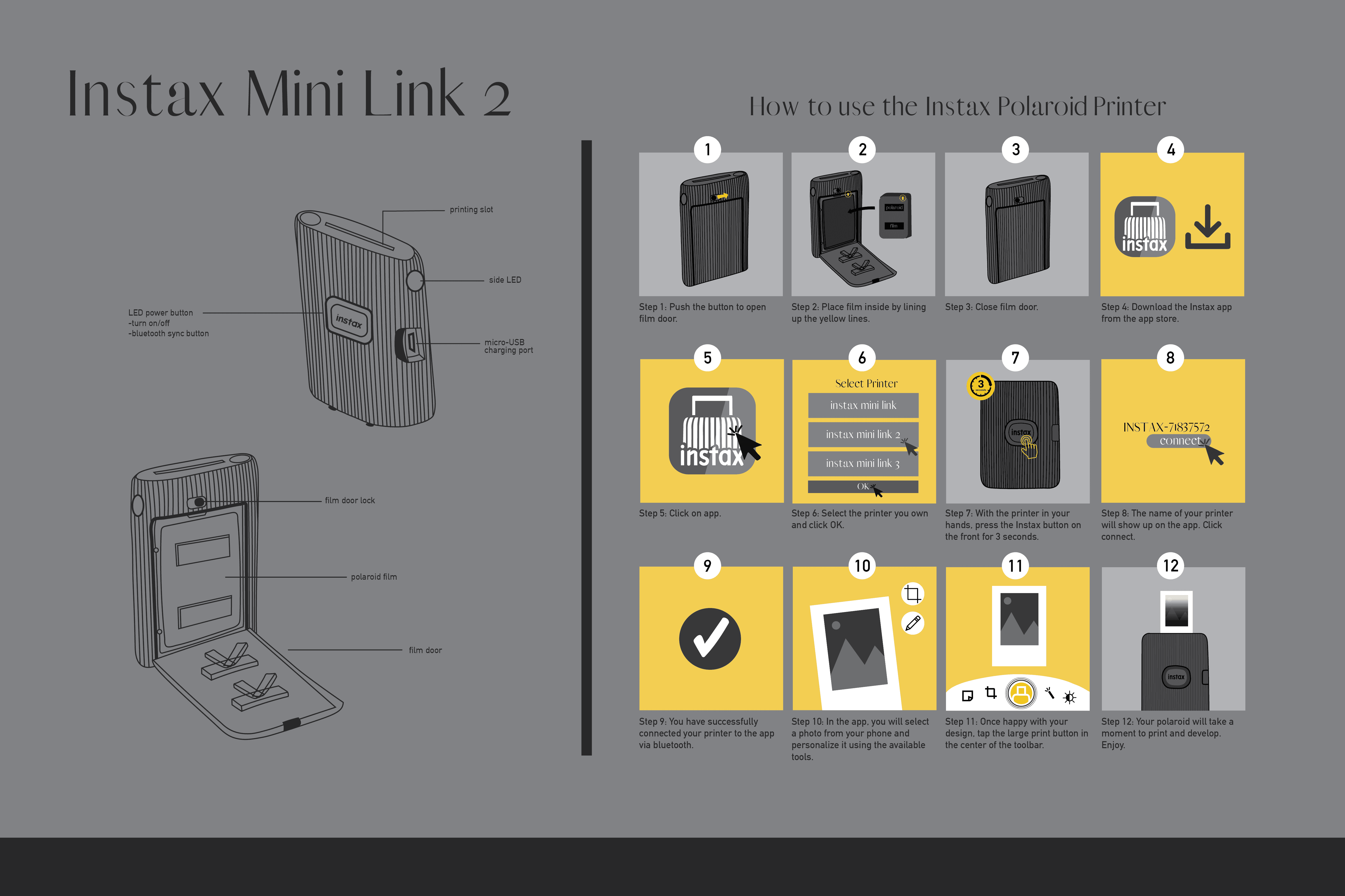
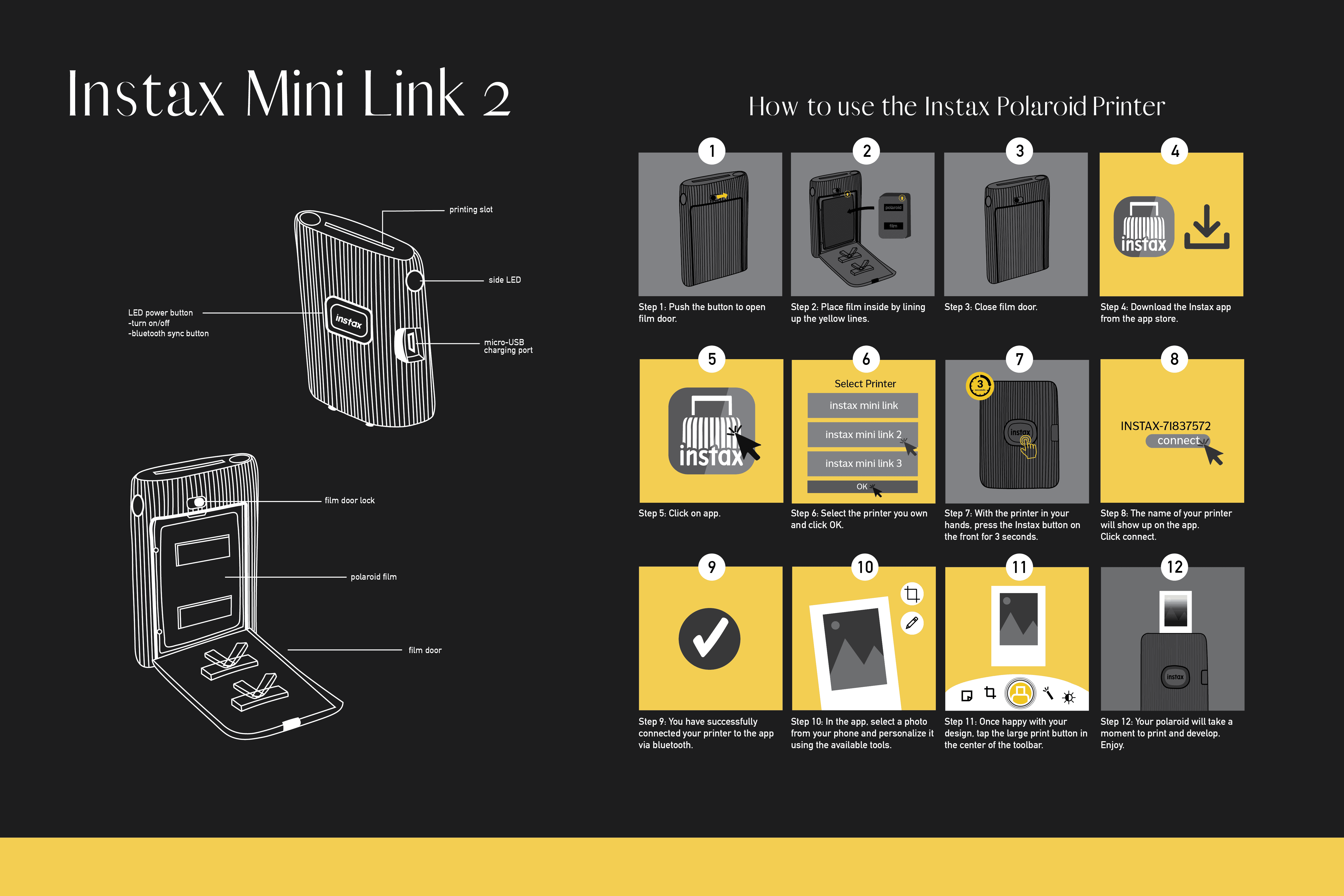
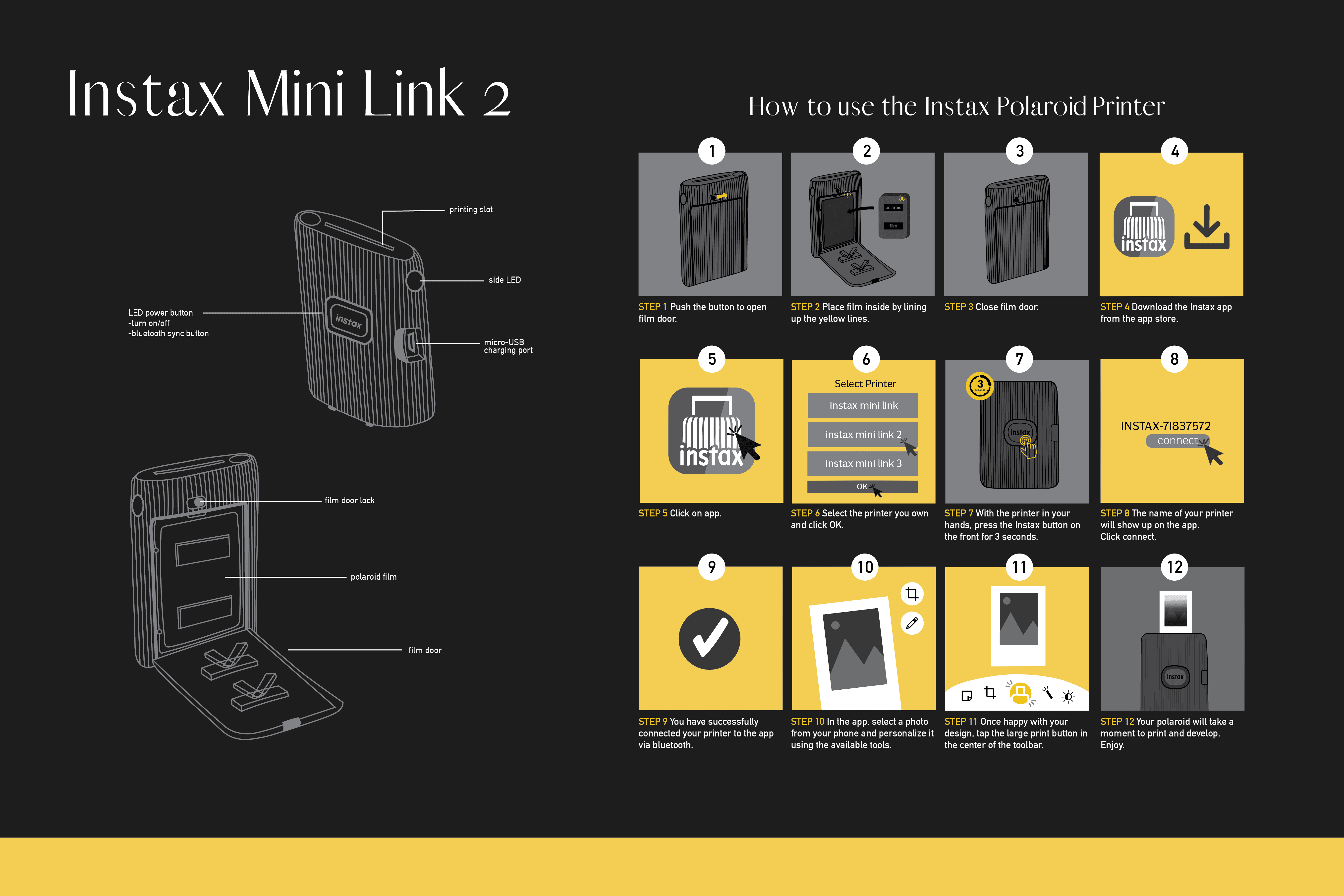
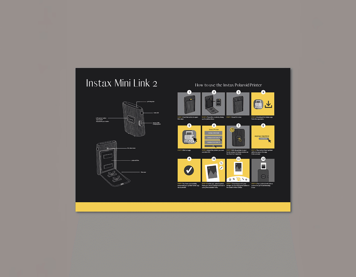
Beginning Poster; Middle of the Process; Final Poster
CHALLENGES
One of the limitations for this project was colour. We were limited to 4 colours which made it tricky, especially creating a design for a company that is often so bold and colourful. The best solution to maximize interest and contrast, was to take a colour from the Instax branding and use it against neutral colours. Four colours sounds pretty simple, right? Wrong! Even with 3-4 colours chosen, it was hard deciding how the poster should look and where to place certain colours.
I wanted this poster to stay simple, but the process itself gets more complicated the more steps you add. One of the biggest challenges was finding the right balance between keeping the steps clear and not overwhelming the viewer with too much information at once. I also had to work within a strict four‑colour palette, which meant being intentional about where to create emphasis and how to add visual variety. Breaking the process into realistic, easy‑to-follow steps was especially tricky since pairing via Bluetooth isn’t always straightforward to show in a static, illustrated layout.
FINAL DESIGN
Already feeling confident in layout design, this project helped refine my technical illustration skills and taught me how even the simplest steps can make or break the process. Too much information and the viewer doesn't want to waste their time trying to interpret it, too little, and they are left with too many questions without answers. This 12-step-poster covers only the essential steps: powering on the device, inserting the film, downloading the app and then printing a polaroid photo... leaving the final poster simple and straightforward.